Introducing the Accessible Media Picker for Umbraco v13

So here we are, the first week of Hacktoberfest 2024 - and I've released a new package for Umbraco v13.
Introduction
The package is an alternative to the core Umbraco Media Picker 3, well, alternative isn't the right term it's more a "replacement". Essentially it is the core picker but with the addition of a few more options for images around accessibility. The idea came from a conversation that happened in the Umbraco MVP Slack, and the Umbraco Discord around managing Alternative Descriptions for media - should they be set on the media item? Could different descriptions be needed if using different crops of the same image? How can an image be flagged as decorative by an editor?
This lead me to revisit an idea I had quite some time ago, can I extend the core media picker with some additional fields - the short answer is - in the AngularJS back office - No. There are no extension points to hook into that I could find. However, once I started exploring the core editor and views I realised it wouldn't be "too" much work to copy them into a custom package and edit them for my needs. So that's what I did and here is the package.
Accessible Media Picker - The Package
Installation
Nice and simple, the package is available on NuGet and can be installed with the following command:
dotnet add package HCS.Media.AccessibleMediaPicker
Configuration
Once installed a new Property Editor type becomes available, so create a new Data Type using the new Accessible Media Picker property editor. Once created existing properties that used the core media picker (alias: Umbraco.MediaPicker3) can be replaced with the new one. It has all the same properties/config options as the core one.
Editor View
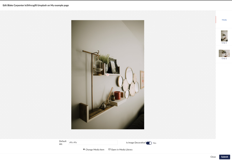
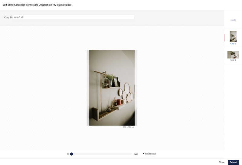
For the most part your editors won't notice much different, the picking of media is exactly the same between this and the core version, however the differences show when editing a picked media item that happens to be an image. The Accessible Media Picker introduces several new fields:
- Default Alt - for storing a top level alt description
- Is Decorative - tells the media item that it should have an empty Alt Text value - this applies to the media item as a whole, including local crops
- Crop Alt - A local crop specific alt description
View when editing a media item - this is where you can flag the item as decorative or set it's primary Alt Description

View when editing a local crop - this is where you can set a crop specific Alt Description

Developer Tools
Right, this is all well and good, but how do you use this in your views? The first thing to know is that your existing rendering code "should" work, the PVC (Property Value Converter) outputs a model that inherits from the MediaWithCrops core model - the model that the core editor outputs (it also handles the same enumerable logic as well).
But, you don't really want that, you want to have access to the Alt Description Logic.
The following snippet demonstrates outputting/checking the various scenarios you may come across:
@if(Model.AccessibleMediaPickerSingle != null)
{
	<div>@Model.AccessibleMediaPickerSingle.DefaultAltDescription</div>
	foreach(var localCrop in Model.AccessibleMediaPickerSingle.CropDescriptions)
	{
		<div>@localCrop.Alias : @localCrop.AltDescription</div>
	}
	<div>Is Decorative: @Model.AccessibleMediaPickerSingle.IsDecorative</div>
	<div>Actual Description: @Model.AccessibleMediaPickerSingle.GetDescription()</div>
	<div>Specific Crop Description: @Model.AccessibleMediaPickerSingle.GetDescription("localCrop")</div>
}
So there you have it, a new media picker to try and help your editors and developers build more accessible websites.
Oh before the important links - this package is open to contributions and is flagged for Hacktoberfest 2024
If you want to get involved or try it out, the links are below. It needs some finessing as the UI is a tad rushed/clunky and PR's would be appreciated.
Links
Special thanks
A couple of special thanks goes to the following people for providing resources or actions that meant this package got made:
- Lottie Pitcher for her Opinionated Starter template.
- Paul Marden for the recent question on Discord and MVP
Banner Photo by Negative Space: https://www.pexels.com/photo/grayscale-photo-of-computer-laptop-near-white-notebook-and-ceramic-mug-on-table-169573/